Our Mission
Lorem Ipsum Goes Here
GGHK stands for Unity In Diversity and everyone aged 18/+ is welcome to participate regardless of sexual orientation, gender identity, ethnicity, or even training level: Games for All.
The Games have never been held in Asia, the world’s largest continent and home to an estimated 221 million LGBTQ+ people. But Asia is also a region where there is an on-going struggle to overcome homophobia and acceptance.
We believe that hosting the Games for the very first time here will be a momentous experience and a cornerstone for our Asian community as well as for the whole world. GGHK can bring all of us together in the name of Sport, Fairness, Respect and Friendship.
Our Logo

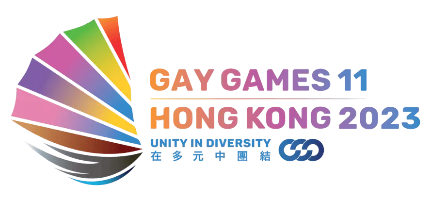
Introducing GGHK2023 Official Logo: SAIL OF UNITY
Until the 1970s, Sampans – the traditional Chinese wooden flat boats – sailed up and down Hong Kong’s Victoria Harbour all day and night creating an iconic waterway. Many of these Sampans displayed striking red sails.
By the 2020s, only a few of these Sampans are still visible on the harbour, but their legacy has become part of the city’s image and culture. The logo for GGHK was designed to represent the diversity of the LGBTQ+ community through the Sampan – with 6 colours from the rainbow flag as sail. Our boat sails on calm waters.
Holding the flag up is a grey hand, representing humanity. The two-coloured wave represents the ocean that unites every country on Earth and gently pushes the boat towards #UnityInDiversity. In 2018 we undertook a public bidding process to find the official logo. The winning logo as voted by the public is our official logo, and was designed by Jom Has.
In 2020 and 2021 Tommaso Panerai, GGHK Brand & Creative Director, tweaked the logo in-line with the new updated branding.

